


Table of Contents
Click to Show/Hide Table of Contents
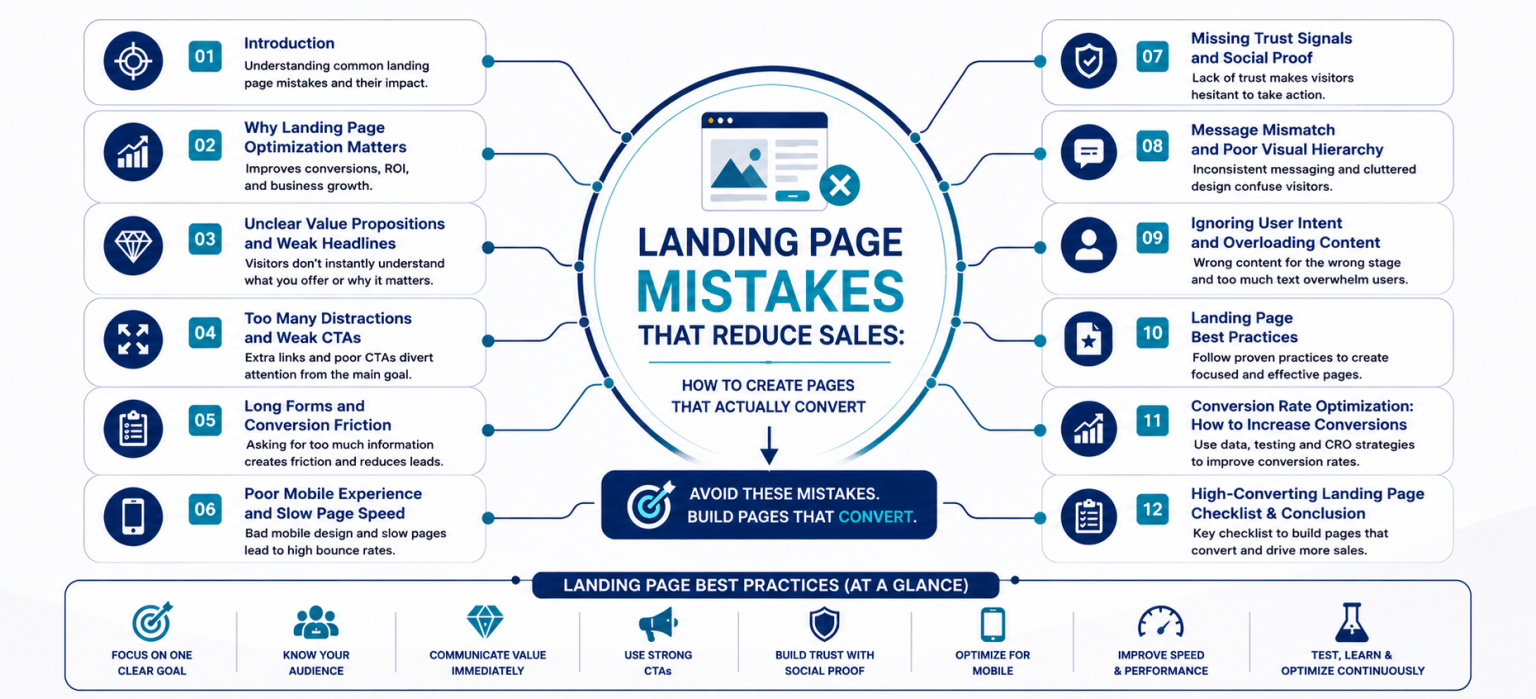
- Introduction
- Why Landing Page Optimization Matters
- Unclear Value Propositions and Weak Headlines
- Too Many Distractions and Weak CTAs
- Long Forms and Conversion Friction
- Poor Mobile Experience and Slow Page Speed
- Missing Trust Signals and Social Proof
- Message Mismatch and Poor Visual Hierarchy
- Ignoring User Intent and Overloading Content
- Landing Page Best Practices
- Conversion Rate Optimization: How to Increase Landing Page Conversions
- High-Converting Landing Page Checklist & Conclusion
1. Introduction
Getting visitors to a landing page is only the beginning. The real challenge is turning those visitors into leads, customers, subscribers, bookings, or sales. A landing page may receive significant traffic and still underperform because small problems in messaging, design, usability, or structure prevent users from taking action.
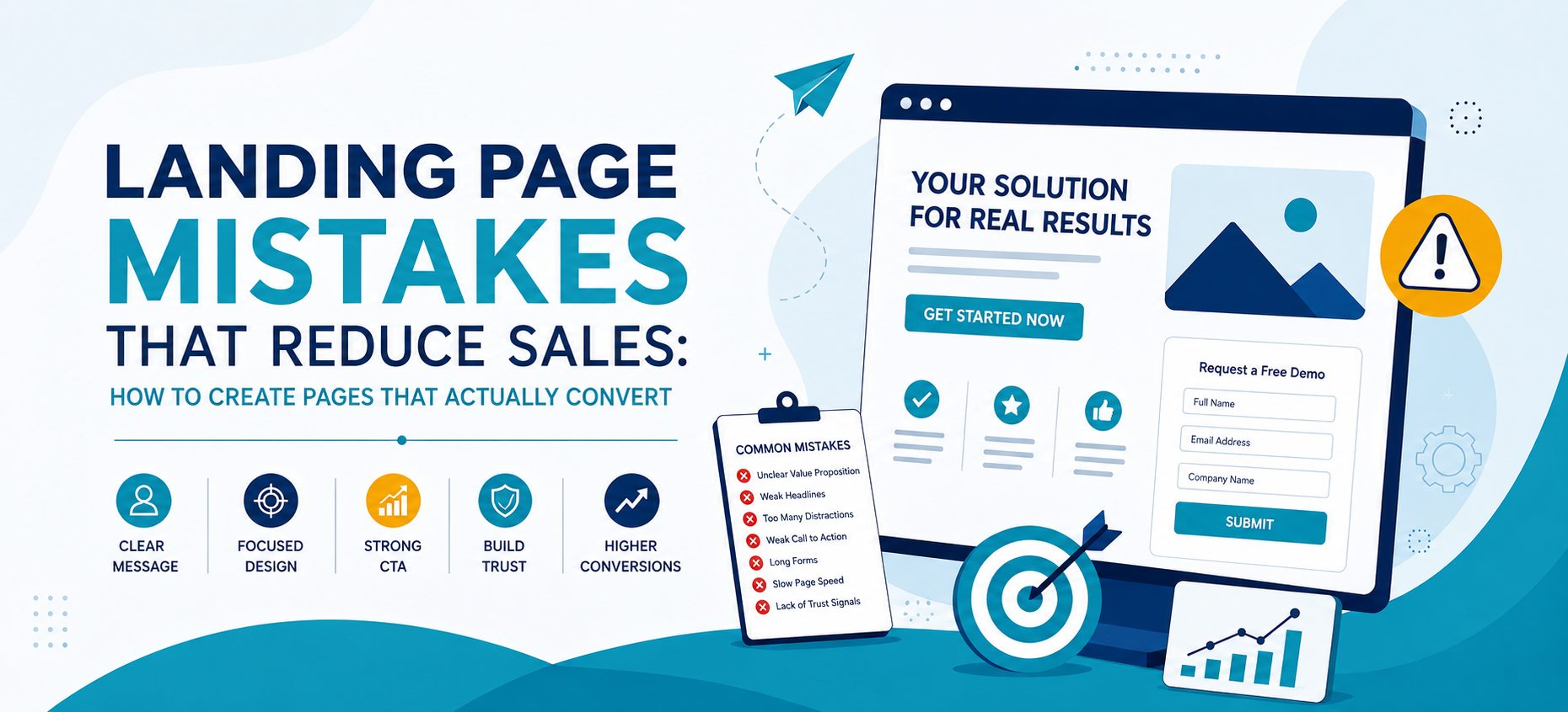
Common landing page mistakes include unclear headlines, distracting layouts, weak calls to action, lengthy forms, slow loading speeds, poor mobile experiences, and a lack of trust signals. Individually, these issues may appear minor, but together they can significantly reduce conversion potential.
Successful landing page optimization focuses on removing these barriers and creating a clear path from visitor interest to conversion. The goal is not simply to make a page look attractive. Every element should help visitors understand the offer, trust the business, and confidently take the next step.
In this guide, we explore the most important mistakes to avoid and the landing page best practices businesses can use to create more effective, high converting landing pages.
2. Why Landing Page Optimization Matters
A landing page usually has one primary purpose. Depending on the campaign, that purpose might be generating leads, selling a product, booking consultations, encouraging registrations, or promoting a downloadable resource.
If visitors arrive but do not complete the desired action, increasing advertising spend alone may not solve the problem. The page itself may need improvement.
Landing page optimization helps businesses make better use of the traffic they already generate.
An optimized landing page can help:
- Generate more leads and sales from existing traffic.
- Improve return on advertising spend.
- Reduce cost per lead and customer acquisition costs.
- Create a clearer and more engaging user journey.
- Improve the quality of enquiries and conversions.
- Increase the overall effectiveness of marketing campaigns.
For example, imagine a landing page receiving 10,000 visitors with a conversion rate of 2%. That generates 200 conversions. Improving the conversion rate to 3% produces 300 conversions without requiring additional traffic.
This is why fixing landing page mistakes can sometimes be more valuable than simply increasing campaign traffic.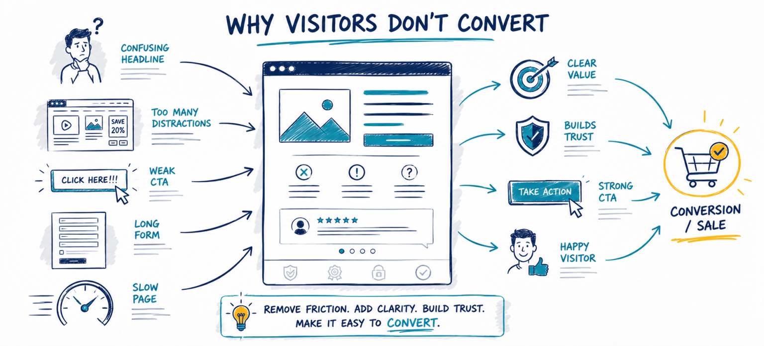
3. Unclear Value Propositions and Weak Headlines
Visitors should be able to understand the purpose of a landing page within seconds. If the headline and opening section do not clearly explain what is being offered and why it matters, users may leave before exploring further.
A strong value proposition should answer three basic questions:
- What are you offering?
- Who is the offer designed for?
- What benefit will the visitor receive?
Generic headlines such as “Welcome to Our Website” or “Solutions for Your Business” communicate very little value. Stronger headlines focus on a specific customer problem, benefit, or outcome.
For example:
Instead of:
“Powerful Marketing Solutions”
Consider:
“Generate More Qualified Leads From Your Existing Website Traffic”
The second headline provides a much clearer reason to continue reading.
How to improve this section:
- Use a clear, benefit-focused headline.
- Avoid unnecessary industry jargon.
- Explain the primary customer outcome.
- Support the headline with a concise subheadline.
- Keep the message consistent with the advertisement or campaign.
Clear positioning is one of the most important foundations of effective landing page optimization.
4. Too Many Distractions and Weak CTAs
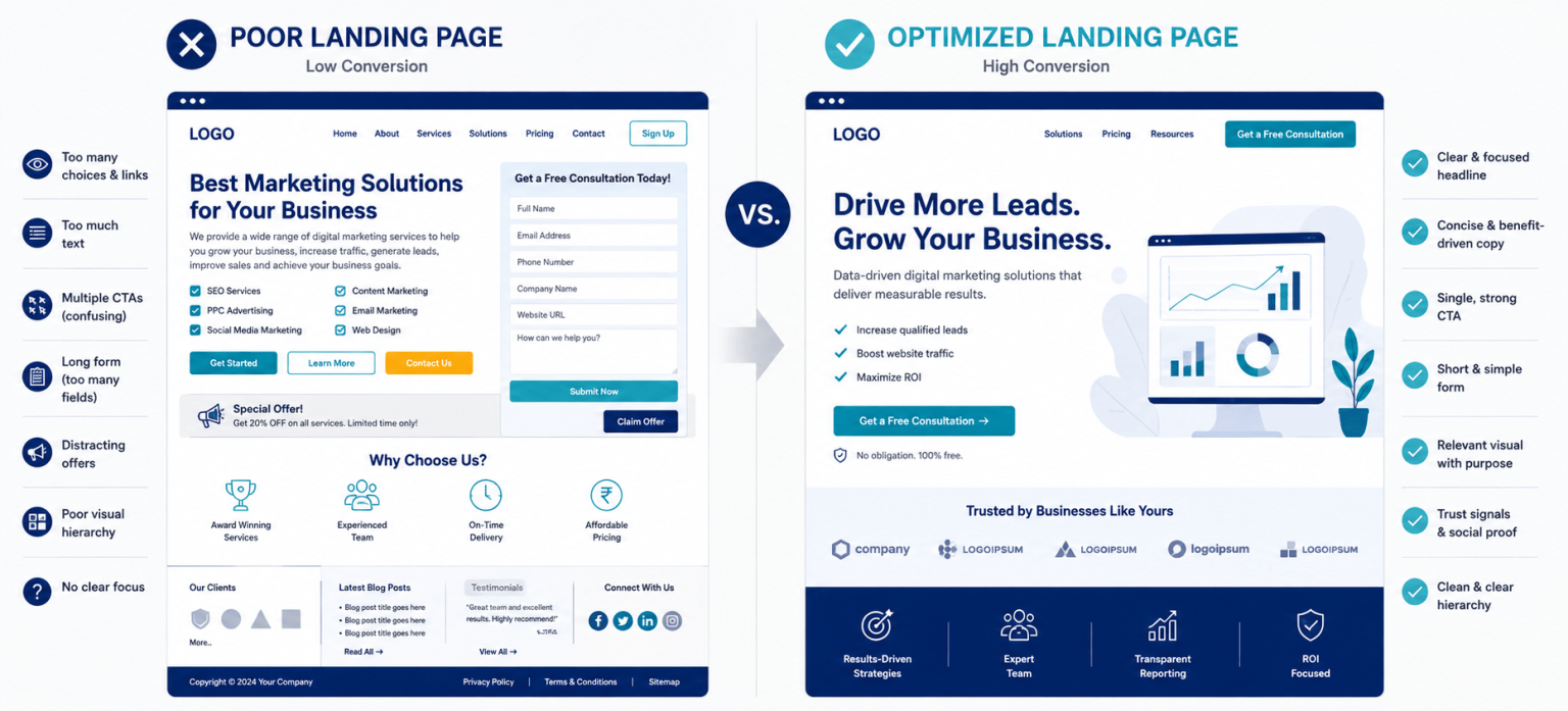
A landing page should guide visitors toward one primary action. Too many choices can create confusion and distract users from the conversion goal.
Common distractions include:
- Large navigation menus
- Multiple unrelated offers
- Too many external links
- Unnecessary animations
- Competing CTA buttons
- Pop-ups appearing too early
Every additional option gives visitors another opportunity to move away from the intended conversion path.
The call to action also plays a critical role. Generic CTA text such as “Submit” or “Click Here” does not clearly communicate what visitors receive after clicking.
Stronger CTA examples include:
- Get My Free Audit
- Book a Consultation
- Download the Guide
- Start My Free Trial
- Request a Quote
Landing page best practices recommend making the primary CTA visually prominent and placing it where users naturally need to make a decision. On longer pages, the CTA can be repeated at relevant points without introducing competing actions.
5. Long Forms and Conversion Friction
Every additional step visitors must complete before converting creates friction. One of the most common examples is asking users to complete unnecessarily long forms.
A visitor downloading a simple guide may hesitate if the form requests a phone number, company size, designation, address, budget, and multiple other details.
The amount of information requested should match the value and nature of the offer.
Ways to reduce conversion friction include:
- Ask only for information you genuinely need.
- Remove unnecessary form fields.
- Use clear field labels.
- Explain what will happen after submission.
- Avoid unnecessary conversion steps.
- Make error messages easy to understand.
A high-value B2B consultation may require more qualification information than an eBook download. The objective is not always to create the shortest possible form, but to avoid requesting information that does not serve a clear purpose.
Reducing unnecessary friction can help businesses increase landing page conversions while creating a better user experience.
6. Poor Mobile Experience and Slow Page Speed
A landing page can look excellent on a desktop and still perform poorly on a smartphone. Mobile visitors need a page designed around smaller screens, touch interaction, and potentially slower connections.
Common mobile landing page mistakes include:
- Text that is difficult to read.
- Buttons that are too small to tap.
- Forms that are difficult to complete.
- Images that do not resize correctly.
- Pop-ups covering important content.
- Too much scrolling before reaching the CTA.
Page speed creates another major source of friction. Large images, unnecessary scripts, heavy videos, excessive plugins, and poorly optimized code can make pages load slowly.
To improve performance:
- Compress and resize images.
- Use optimized image formats.
- Remove unnecessary scripts and plugins.
- Optimize videos and other large assets.
- Use responsive layouts.
- Test important pages across multiple devices.
Speed and mobile usability should be treated as core components of landing page optimization, not simply technical considerations.
7. Missing Trust Signals and Social Proof
Visitors may understand an offer and still hesitate because they are unsure whether they can trust the business. This becomes especially important when users are asked to provide contact information, make a payment, or commit to a high-value service.
Social proof helps reduce this uncertainty by demonstrating that other customers have already trusted the business.
Useful trust signals include:
- Customer testimonials
- Reviews and ratings
- Recognizable client logos
- Case study results
- Industry certifications
- Awards and recognition
- Guarantees
- Secure payment indicators
Specific proof is usually stronger than generic claims. A testimonial describing a customer’s problem and measurable result is more persuasive than a statement simply saying, “Great service.”
Trust signals should also appear close to key decision points, such as forms, pricing sections, and CTA buttons.
8. Message Mismatch and Poor Visual Hierarchy
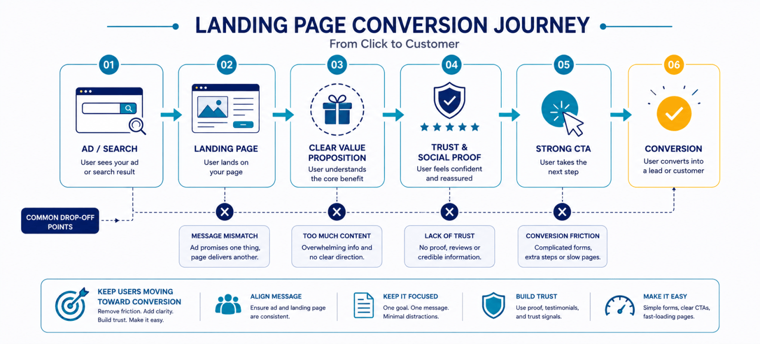
A landing page should feel like a natural continuation of the advertisement, email, search result, or social media post that brought the visitor there.
If an advertisement promises a “Free Website Conversion Audit” but sends users to a general services page, the visitor may immediately question whether they reached the correct destination.
Maintain message consistency across:
- Headlines
- Offers
- Promotional details
- Visual branding
- Audience targeting
- CTA messaging
Visual hierarchy is equally important. Visitors rarely read every sentence in sequence. They scan the page and use headings, images, highlighted information, and buttons to determine what deserves attention.
A strong visual hierarchy should naturally guide users through:
Headline → Value Proposition → Benefits → Proof → CTA
Use whitespace, clear headings, short paragraphs, bullet points, and visual contrast to make important information easier to identify.
9. Ignoring User Intent and Overloading Content
Not every visitor arrives with the same objective or level of purchase readiness. Landing pages should therefore reflect the user’s intent and stage of the customer journey.
For example:
- Awareness stage: Educational guides, reports, checklists, or webinars.
- Consideration stage: Case studies, comparisons, demonstrations, or consultations.
- Decision stage: Pricing, quotations, trials, bookings, or purchase options.
Ignoring intent can result in an offer that feels irrelevant or asks visitors to commit too early.
Another related mistake is adding too much content. Businesses sometimes attempt to answer every possible question on a single landing page, resulting in long paragraphs and repetitive messaging.
Keep content focused by:
- Prioritizing information needed for the conversion decision.
- Using short, scannable sections.
- Replacing long explanations with bullet points where appropriate.
- Removing repeated messages.
- Using FAQs for secondary questions.
The goal is not necessarily to make every landing page short. The goal is to provide enough information to support the decision without overwhelming the visitor.
10. Landing Page Best Practices
Successful high converting landing pages tend to follow a consistent set of principles. Rather than relying on visual design alone, every element supports the same conversion objective.
Important landing page best practices include:
- Focus on one goal: Every major element should support the primary conversion.
- Communicate value immediately: Make the offer and customer benefit clear near the top.
- Write for customers: Focus on benefits and outcomes rather than only features.
- Use clear CTAs: Tell visitors exactly what action to take.
- Reduce friction: Simplify forms and unnecessary steps.
- Add social proof: Support claims with testimonials, reviews, or results.
- Optimize for mobile: Make every important action easy on smaller screens.
- Prioritize speed: Avoid making visitors wait for unnecessary assets.
- Maintain message consistency: Align advertisements and landing page content.
- Test continuously: Use real performance data to guide improvements.
These principles create a clearer customer journey and provide a strong foundation for ongoing conversion rate optimization.
11. Conversion Rate Optimization: How to Increase Landing Page Conversions
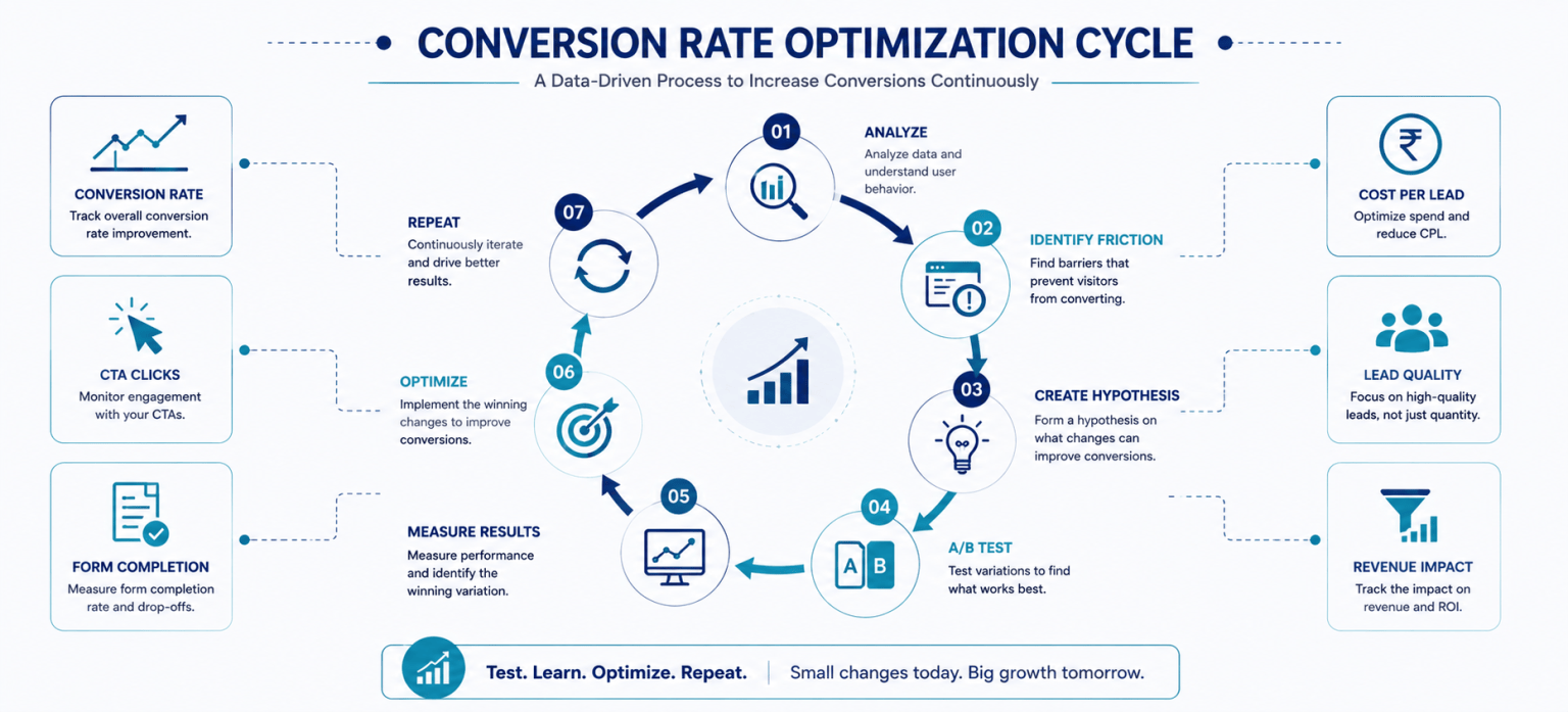
Conversion rate optimization (CRO) is the process of using data, testing, and user behaviour insights to improve the percentage of visitors completing a desired action.
Instead of redesigning a page based entirely on assumptions, CRO helps businesses identify where visitors hesitate, abandon forms, ignore CTAs, or leave the page.
To increase landing page conversions:
- Analyze traffic quality: Understand who is visiting the page and where they came from.
- Review the headline: Make sure it clearly communicates the main benefit.
- Evaluate the offer: Ensure the value justifies the action being requested.
- Reduce friction: Simplify forms and remove unnecessary steps.
- Strengthen trust: Add relevant testimonials, reviews, and proof.
- Improve CTA visibility: Make the next step obvious.
- Review mobile performance: Test the entire conversion journey on smartphones.
- Run A/B tests: Compare variations of important elements.
Businesses can test headlines, CTA wording, form length, hero sections, testimonials, images, page layouts, and offers.
Important CRO metrics include:
- Landing page conversion rate
- CTA click-through rate
- Form completion rate
- Cost per lead
- Cost per acquisition
- Lead quality
- Revenue generated
The goal should not simply be to generate the highest number of conversions. Successful landing page optimization should also improve lead quality, customer acquisition efficiency, and business outcomes.
12. High-Converting Landing Page Checklist & Conclusion
Before launching a campaign, use this checklist to identify potential landing page mistakes that could reduce performance.
- Does the landing page have one clear conversion goal?
- Is the value proposition immediately understandable?
- Does the headline communicate a meaningful benefit?
- Does the page match the advertisement or campaign message?
- Is the primary CTA clear and easy to find?
- Have unnecessary links and distractions been removed?
- Does the form ask only for necessary information?
- Are testimonials or other trust signals included?
- Is the content easy to scan?
- Does the page work correctly on mobile devices?
- Is page speed optimized?
- Are conversion events being tracked?
- Is the page being tested and improved over time?
Creating high converting landing pages does not require filling the page with more content, features, or design elements. It requires understanding what visitors need to make a decision and removing anything that creates unnecessary confusion or friction.
By avoiding common landing page mistakes and following proven landing page best practices, businesses can create clearer and more persuasive conversion journeys. Continuous landing page optimization and conversion rate optimization can then help increase landing page conversions, improve marketing efficiency, and generate more value from existing traffic.


 65
65