
Enhancing Ace Cloud
with a Modern UI/UX Experience
A Comprehensive Approach to Brand Identity and Web Experience
-
Services Offered:
- Brand Book Creation
- Brand Identity Development
- Logo Design
- UI/UX Design & Development
- Web Development
- Web Experience Design
- Web Maintenance
- Website Frontend Design & Development
- Website Optimization
- Website redesigning
- Website Strategy
- Wireframing & Prototyping
PROJECT ROADMAP:
Objectives:
- Revamping the Entire Website
- Creating a Universal Appeal for a Global Audience
- Showcasing Three Key Services
- Boosting User Engagement Across the Site
- Streamlining Website Design to Seamlessly Integrate Services
- Enhancing User Experience and Satisfaction
- Improving Website Conversion Rates
- Incorporating a Live Chat Widget
Challenges:
- Connecting 3 Key Services in a Unified Logo
- Making Services Easily Accessible (Display All on Homepage)
- Balancing Brand Identity with Technical Creativity
- Custom Icons, Patterns, and Backgrounds
- Unique Colour Palette for 3 Key Services
- Low User Engagement
- Lack of Communication Channels
- Insufficient Service Information
A Strategic Approach to Brand Book Creation
The Ace Cloud brand book provides a comprehensive set of guidelines for presenting the brand consistently across all platforms. It ensures a unified approach to messaging, tone, and visual identity, fostering trust and recognition with customers. The brand book also aligns teams and stakeholders with Ace Cloud’s core values, mission, and vision, streamlining decision-making and maintaining a cohesive brand experience.
Strategy and Execution
- The logo design was carefully crafted based on three key parameters: Cybersecurity, Cloud services and other services. Extensive research went into its development, ensuring it symbolized the brand’s commitment to data protection.
- The triangle in the logo represents security, while the colours used in the logo are not from a typical palette. Instead, each color is a blend of two shades, carefully chosen to represent Ace Cloud’s services. This thoughtful combination of colors enhances the brand's identity in a unique and precise way.
- A dedicated content team was tasked with crafting the brand book, ensuring it was fully aligned with Ace Cloud’s requirements. Each section was meticulously developed, covering every facet of the brand, from the business cards to the backdrop, to provide a clear and cohesive guide for the company’s identity and messaging.
- Every dimension for the brand materials was carefully calculated, ensuring consistent spacing between logos, borders for brochures and business cards, and other design elements, maintaining harmony across the entire brand book.
- The font selection was done with great attention to detail, choosing typefaces that enhanced the brand's identity. Consistency in font usage was maintained across all brand materials, ensuring a unified and professional presentation.
- A unique color palette and specific font styles were selected that align with the brand's identity and are suitable for its domain. These elements ensure visual consistency across all communication channels.
- All the icons used in the brand book were custom-designed by the team, ensuring they reflect the brand’s unique identity and values.
- The design and content for key brand materials were finalized, such as email signatures, banners, PowerPoint slides, and promotional items like mugs, caps, pens, business cards, and identity cards. Each piece was tailored to ensure the brand’s identity is consistently represented.
- The design for important stationery like brochures, envelopes and letterheads was carefully selected, ensuring they align with the brand’s visual style and tone of communication.
- The backdrop for events or conferences was designed to complement the brand’s identity and enhance visibility, ensuring consistency across all physical spaces.
- All buttons on the website were designed with a consistent gradient or a clean white look to ensure a unified and polished user experience.
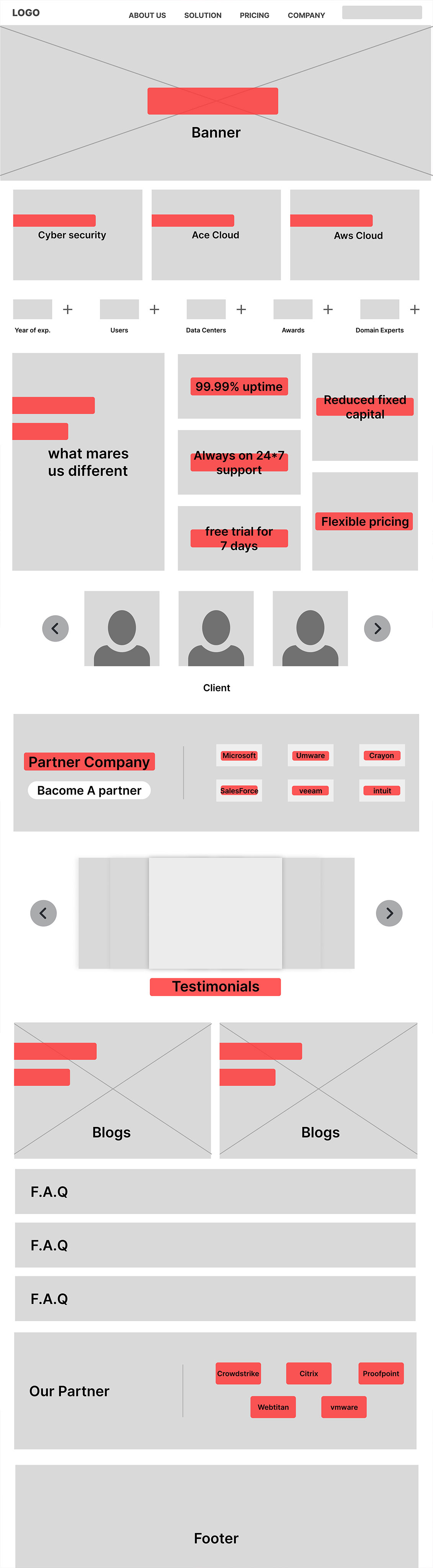
Wireframe Development Process
The wireframe development process focuses on creating a seamless user experience by prioritizing key design elements and aligning them with the brand’s identity. The following pointers highlight the key areas of design that were considered to ensure clarity, consistency, and functionality throughout the wireframe:
Colour Palette:
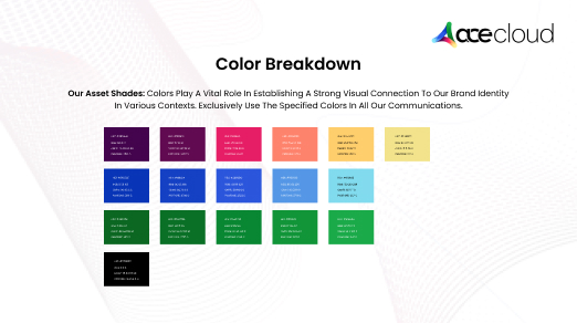
A thoughtfully selected color palette has been crafted to align with the brand’s personality and messaging. The primary and secondary color schemes are designed to ensure visual consistency across all platforms, evoking the intended emotional response. Pantone, CMYK, RGB, and hex codes have been defined for precise color representation throughout the design.
Typography:
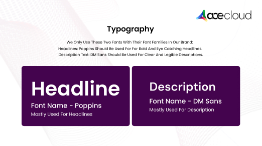
The typography has been carefully chosen to reflect the brand’s tone while enhancing readability and hierarchy. Specific fonts have been allocated for headings, subheadings, and body text, with clear definitions for size, weight, and line spacing, ensuring an optimal user experience.
Logo Style:
A logo has been designed to be simple, memorable, and responsive, encapsulating the brand’s identity. It maintains versatility across various platforms and embodies timelessness, contributing to strong brand recognition.
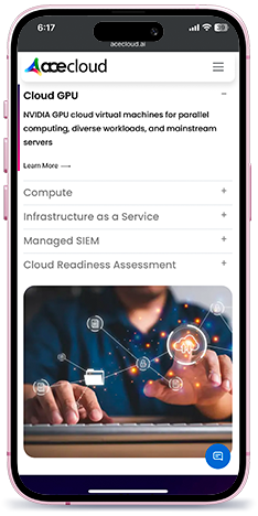
Additional Wireframes:
- Public Cloud: The layout has been designed with structured content and icons to facilitate easy navigation.
- Service: SOS-as-a-Service: This service is presented clearly, with a concise and organized layout.
- Sub Service: Block Storage: The design incorporates icons and detailed descriptions for better user understanding.
- About Us: The wireframe includes the brand story and values, supported by visuals to humanize the brand.
- Technology Partners: Partner logos and brief descriptions are clearly displayed to enhance partner visibility and understanding.
Icons & Visuals:
Intuitive and simple icons have been developed to visually represent services, product features, and processes. These icons maintain consistency in style and are designed to enhance overall visual appeal and user comprehension.
Feedback and Revisions
The wireframe elements have undergone thorough review cycles, ensuring the design is refined based on valuable feedback and usability tests. This process has resulted in a design that is clear, functional, and visually engaging.
Responsive Design:
All elements of the wireframe have been tested for responsiveness across various devices, ensuring a consistent and seamless user experience on both mobile and desktop platforms. Typography, logos, and imagery adapt fluidly to maintain visual consistency.
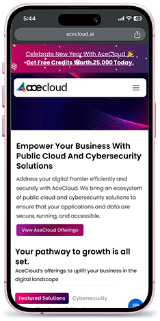
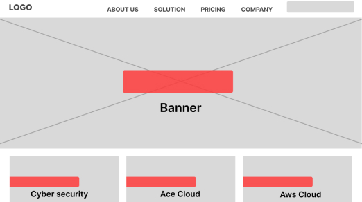
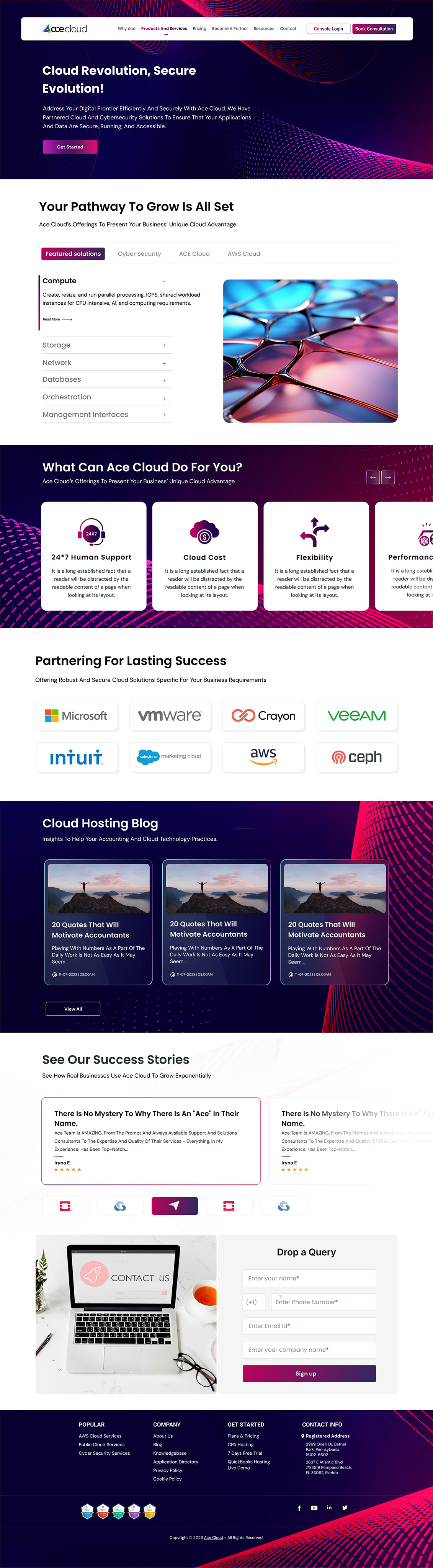
Home Page Wireframe
The home page wireframe has been finalized, focusing on effective space allocation and the prioritization of key content elements. Key components, such as the hero section, logo, main navigation, and call-to-action buttons, are strategically placed to create a seamless and intuitive user journey.
Outcome of Digital Revamp
By creating a unified brand book, refining the logo, selecting a unique color palette, and designing a responsive website wireframe, AceCloud enhanced its visual identity and user experience. Custom icons and streamlined content ensured clear communication of services, improving accessibility, user engagement, and conversion rates. The project successfully established AceCloud as a cohesive and recognizable brand, prepared for growth and increased customer interaction in the digital space.
Explore the treasure
Read Our Bank of Case Studies
Designed & Curated to further fuel your Imagination
Find what we do, how we do it, and how further we can serve you in future. Serving our best on a platter below.


We're a digital agency focused on
creative and results-driven solutions.
