
Elevate Crax Digital with
a High Performance Website
Transforming Brand Presence with Engaging Digital Experiences
Packaged Snacks Manufacturer

-
Services Offered:
- Corporate Branding Photography
- Product Photography
- UI/UX Design & Development
- Web Development
- Web Maintenance
- Website Frontend Design & Development
- Website Optimization
- Website Strategy
- Wireframing & Prototyping
PROJECT ROADMAP:
Objectives:
- Design a Website Targeting the Indian Market
- Drive User Engagement on the Website
- A Streamlined Website to Integrate Products
- Enhance User Experience and Satisfaction
- Increase the website conversion rate
Challenges:
- Low User Engagement
- Content-Heavy and Not User-Friendly
- Disintegrated website
- Inadequate Information on Products
- The new website improved performance over the slower old version
THE WAY TO A WEBSITE WIREFRAME
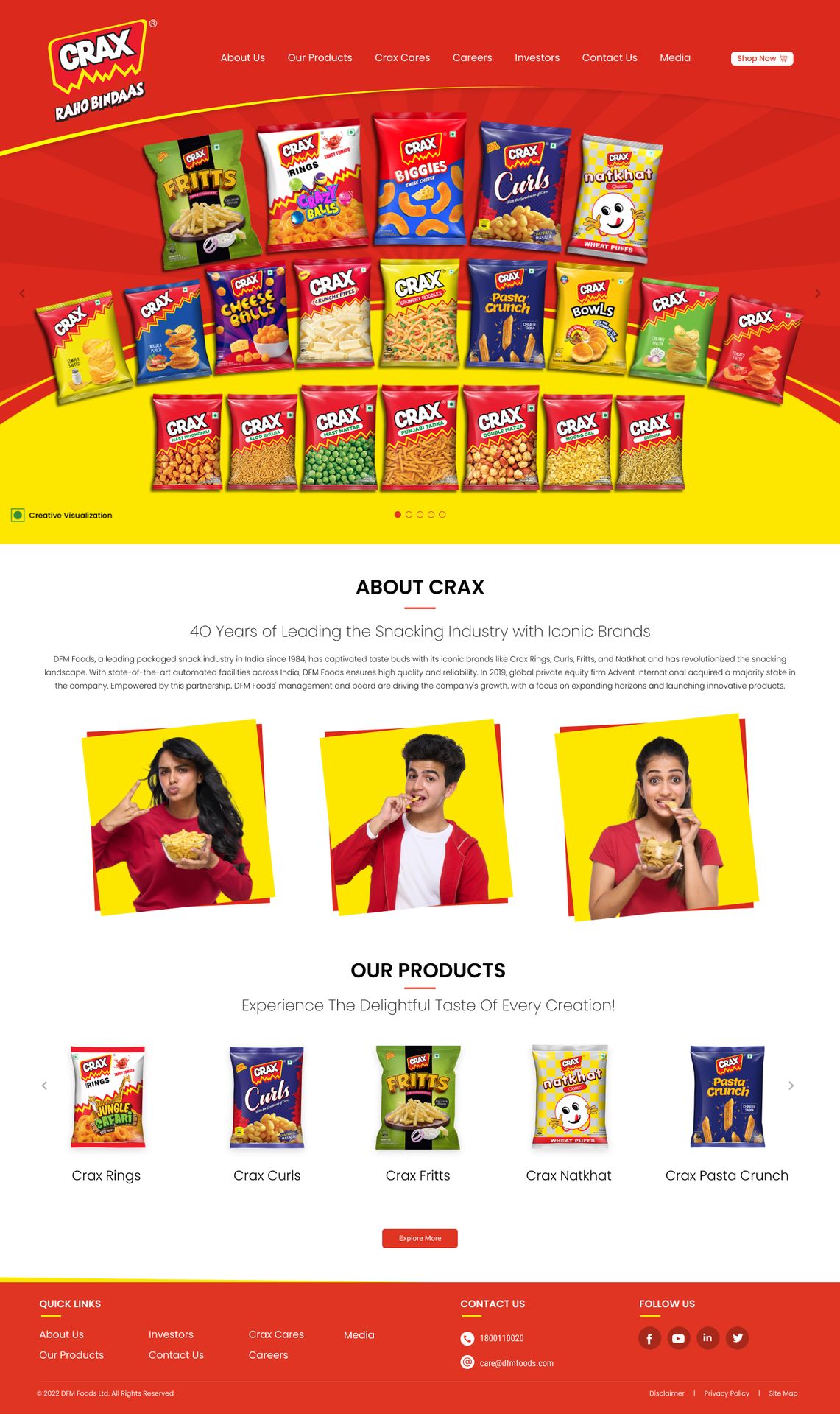
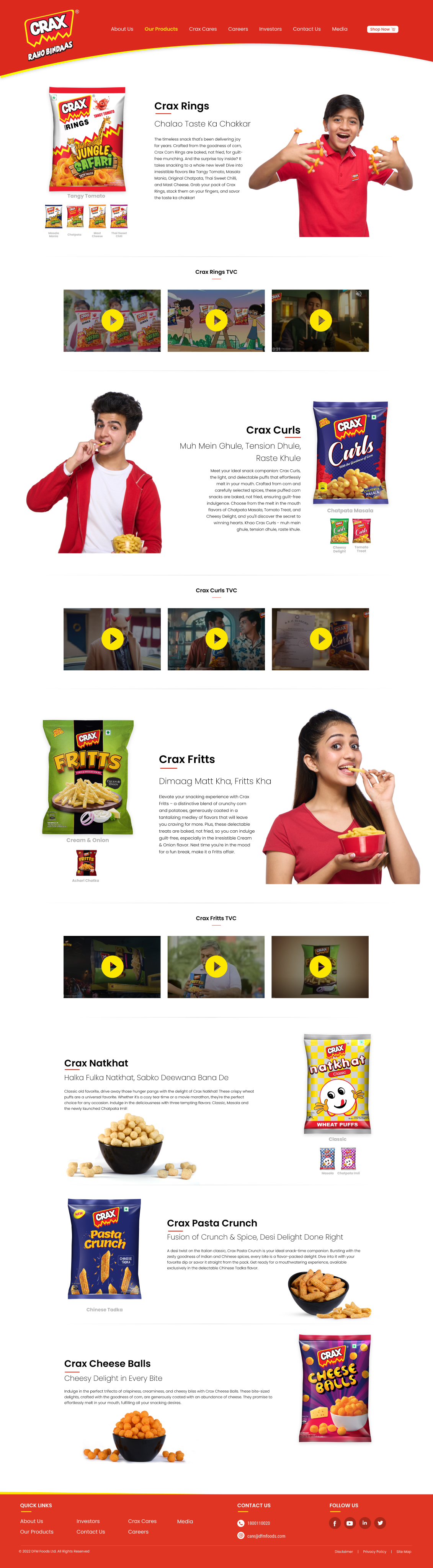
Crafting an effective website wireframe for Crax began with a solid foundation of research-driven insights. The team meticulously outlined key pillars to ensure the design aligned with the brand’s objectives. Recognizing the product's kid-centric appeal, the wireframe was shaped to be vibrant, playful, and engaging for young users while subtly appealing to parents as decision-makers. Navigation was structured for simplicity, with a layout that combined visual appeal for children and practical usability for adults. The design created an interactive experience that reflected the brand’s lively personality while meeting the needs of its unique audience.
Creating a Blueprint:
- Mapped out key pages and their interactions
- Finalizing pages, banners, sections, and forms
- Designing the Homepage and About Us page using Figma
- Ensuring user interactivity and ease of use
- Optimized for mobile compatibility
Establishing Digital Presence
- Established a digital presence for a well-known, traditional brand
- Integrated digital strategies with existing traditional strengths
- Leveraged brand recognition to quickly gain online traction
- Developed a user-friendly platform for both new and existing customers
Decorating a Wireframe:
The website was designed to align with the desired user interaction.
- Placement of product categories, individual products, content, and images
- Arrangement of intended user interactions
- Added interactive elements like buttons and links
- Established content hierarchy for intuitive navigation
- Structured layout for optimal page load speed
Immersive UI/UX
Regulating user navigation across the website
In-depth design discussions with Crax led to the careful selection of fonts, color schemes, and custom-designed icons, images, shapes, and patterns. The vibrant product colors were a key consideration, so the team chose a clean white base for the website to make the visuals pop. The goal was to create a kid-friendly, visually engaging site that is easy to navigate and interactive for young users. Subtle, playful animations were added to enhance the overall UI/UX experience, making it fun and dynamic.
This design approach aligns perfectly with the preferences of the target audience.
Additionally, the website was linked to e-commerce platforms, allowing users to purchase directly from the site.
Message That Resonates
Visual Enhancements: Custom-designed banners and professional product photoshoots were executed to enhance the website’s visual appeal and showcase the brand’s offerings cohesively. A personal touch was added by conducting an in-house photoshoot to give the website a more authentic feel. Different pages were created to cater to distinct buyer personas, such as separate pages for investors and parents. Efforts were made to strike a balance across all pages, ensuring that while they were tailored to specific audiences, they still maintained a consistent visual identity to reflect the brand’s core message.
Defining a Strong Visual Identity
Crax’s clear objective to stand out in a competitive market shaped the approach to building a cohesive, striking visual identity. The design emphasized vibrant product colors that ensured the offerings stood out, while maintaining a clean base to create visual contrast and appeal. A balanced approach was taken to ensure that even though pages targeted specific buyer persona, the visual identity remained consistent across the site. This maintained a unified brand feel without disrupting the experience for different audiences. The design process included:
- Reviewing the wireframe created in Figma for thoroughness and functionality.
- Developing the UI using the finalized color palette and selected fonts.
- Strategically placing content and interactive buttons, ensuring smooth navigation and user engagement.

Executing the Design
The UI designed on Figma was translated into code using HTML, with the planned designs refined and integrated to ensure full functionality across the website. Crax aimed to deliver an engaging, user-friendly experience while meeting its business objectives. Thus, flexibility and dynamism were our top priorities, guiding us to deliver:
- Reusable Code
- High-Quality Prototypes
- Enhanced Product Image Modifications
- A Mobile and Desktop-Responsive Website
Explore the treasure
Read Our Bank of Case Studies
Designed & Curated to further fuel your Imagination
Find what we do, how we do it, and how further we can serve you in future. Serving our best on a platter below.


We're a digital agency focused on
creative and results-driven solutions.
